Digital Services Design Language overview 
The Digital Services Design Language is an ongoing effort to unify the user experience across all of Cal-ITP’s websites and applications – calitp.org, California Mobility Marketplace (MobiMart), and Cal-ITP Benefits.
End users will benefit from a consistent feeling across each product, increasing usability through predictability and building trust in the Cal-ITP brand.
For our own efforts in maintaining these products, using a unified structure of color, spacing, type, and components will reduce error and increase speed for both design and dev, while including flexibility to meet specific product needs.
For example, a comprehensive color palette is included. Each product can draw on different parts of it and feel unified while maintaining its own individual identity. Similarly, we have base styles and sizes for typography, but can use different font stacks to adapt to each product.
Color 
Brand colors 
-
Cal-ITP Blue
(blue 70) -
Cal-ITP Cyan
(cyan 40) -
Cal-ITP Yellow
(yellow 30)
Full palette 
When paired with black, the values of the colors in the 10–50 range have been selected to have a color contrast that complies with WCAG 2.2 Level AA (at least 4.5:1), and the values in the 60–100 range have compliant contrast when paired with white.
-
red
10 -
red
20 -
red
30 -
red
40 -
red
50 -
red
60 -
red
70 -
red
80 -
red
90 -
red
100
-
orange
10 -
orange
20 -
orange
30 -
orange
40 -
orange
50 -
orange
60 -
orange
70 -
orange
80 -
orange
90 -
orange
100
-
yellow
10 -
yellow
20 -
yellow
30 -
yellow
40 -
yellow
50 -
yellow
60 -
yellow
70 -
yellow
80 -
yellow
90 -
yellow
100
-
green
10 -
green
20 -
green
30 -
green
40 -
green
50 -
green
60 -
green
70 -
green
80 -
green
90 -
green
100
-
cyan
10 -
cyan
20 -
cyan
30 -
cyan
40 -
cyan
50 -
cyan
60 -
cyan
70 -
cyan
80 -
cyan
90 -
cyan
100
-
blue
10 -
blue
20 -
blue
30 -
blue
40 -
blue
50 -
blue
60 -
blue
70 -
blue
80 -
blue
90 -
blue
100
-
purple
10 -
purple
20 -
purple
30 -
purple
40 -
purple
50 -
purple
60 -
purple
70 -
purple
80 -
purple
90 -
purple
100
-
indigo
10 -
indigo
20 -
indigo
30 -
indigo
40 -
indigo
50 -
indigo
60 -
indigo
70 -
indigo
80 -
indigo
90 -
indigo
100
-
pink
10 -
pink
20 -
pink
30 -
pink
40 -
pink
50 -
pink
60 -
pink
70 -
pink
80 -
pink
90 -
pink
100
-
gray
10 -
gray
20 -
gray
30 -
gray
40 -
gray
50 -
gray
60 -
gray
70 -
gray
80 -
gray
90 -
gray
100
-
slate
10 -
slate
20 -
slate
30 -
slate
40 -
slate
50 -
slate
60 -
slate
70 -
slate
80 -
slate
90 -
slate
100
(DSDL Black)
Typography 
To maintain flexibility across products, we use a set scale with multiple typeface options for brand typefaces (larger, stylized typefaces used for emphasis and headlines, or “display” copy) and base typefaces (highly legible typefaces used for body copy, smaller captions and labels, etc.).
Typefaces 
calitp.org and MobiMart use Space Grotesk as their brand typeface and Noto Sans as their base typeface. Cal-ITP Benefits (including the back-end admin interface) uses Noto Sans as both brand and base typeface.
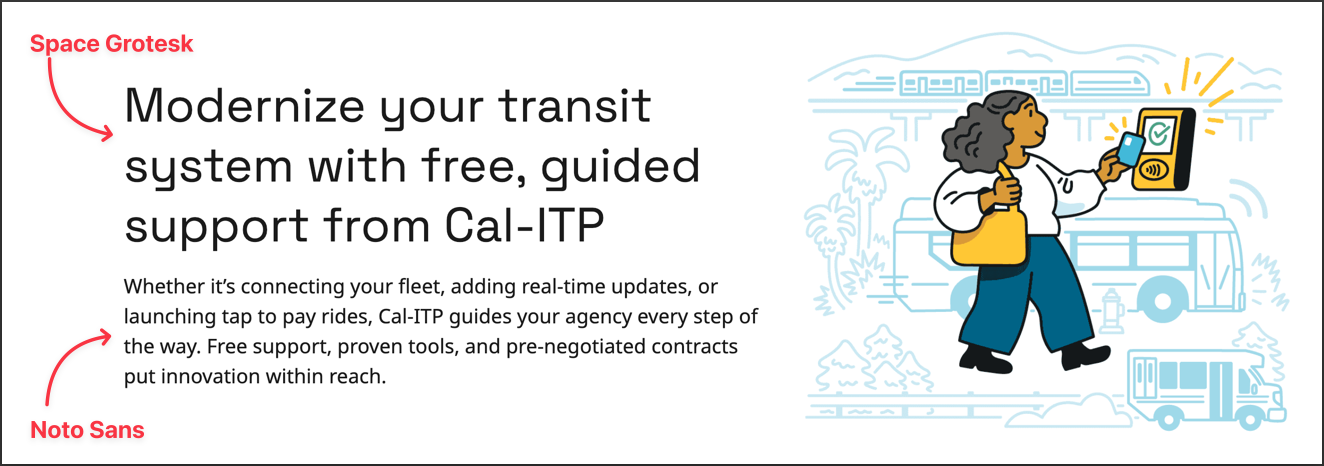
Space Grotesk 
Space Grotesk is a proportional sans-serif typeface with modern feeling and strong readability. It has a sense of urbanity and trustworthiness, with strong, clean lines.
Noto Sans 
Noto is designed specifically for accessibility and global communication, offering high-quality fonts with various weights and widths in sans, serif, mono, and other styles. This font family supports over 1,000 languages and 150 scripts. It’s a contemporary, aesthetic font with high legibility. It supports scripts of California’s main languages: English, Spanish, Mandarin + Cantonese, Tagalog, Vietnamese, Korean, Armenian, Arabic, Russian, Farsi, Hindi, and Japanese.
Source Code Pro 
Source Code Pro is an open-source monospace typeface designed to work well in user interface and coding environments. It is used on Cal-ITP products when fixed-width type is appropriate, such as displaying code.
Core style matrix and type hierarchy 
| Headlines | Titles | Subtitles | Body |
|---|---|---|---|
| Headline L | Title L | Subtitle L | Body L |
| Headline M | Title M | Subtitle M | Body M |
| Headline S | Title S | Subtitle S | Body S |
- Heading 1 (Headline L)
- Heading 2 (Headline M)
- Heading 3 (Title M)
- Heading 4 (Subtitle M)
- Heading 5 (Title S)
- Heading 6 (Subtitle S)
Additional common styles 
- Display
- Small caps
- Caption
- Footnote
- Code